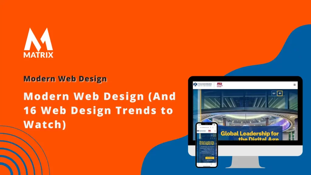
Modern Web Design (And 16 Web Design Trends to Watch)
Learn About The Modern Web Design (And 16 Web Design Trends to Watch).
As online marketing becomes increasingly competitive, staying up-to-date on the latest web design trends is critical. Technologies develop at a rapid pace, and new approaches to website design emerge continually.
From understanding how customers interact with different elements of a page to leveraging social media for maximum reach, modern web design emphasizes creating engaging experiences that drive conversions—regardless of the device or platform used by the audience.
To help marketers stay abreast of modern web design trends and ensure success in this dynamic climate, we’ve compiled 16 must-know tips and tricks. Read on to become better informed about current best practices!
Modern Website Design – What’s the Difference from Old Web Design
With the advancement of technology, modern website design has come a long way from the basic and static designs of the early web.
Today, web design has evolved to be more sophisticated and dynamic in terms of functionality, user interface, and user experience. Modern website design focuses on responsiveness, which should be easily accessible and optimized for various screen sizes and devices.
It also highlights the importance of clean and organized layouts, eye-catching graphics, and easy navigation.
Combining all these elements creates an engaging and interactive website that captures the attention of its visitors and encourages them to stay longer. Such a website ultimately helps businesses achieve their goals by increasing their online presence and driving more leads and sales. Top 7 Challenges Facing SEO Managers in 2025
Minimalistic Homepages – How to Create Effective Visual Impact without Clutter and Modern Web Design
In today’s digital age, we spend a lot of time online, which means that first impressions of websites are more important than ever.
When it comes to designing a homepage, less is often more. A minimalistic approach can be just as effective in creating an impact without clutter. It allows for the content and visuals to shine and for the user to easily navigate the website without feeling overwhelmed.
Consider using negative space, a color scheme matching your brand, and high-quality images or graphics to create an effective visual impact. With these design elements in place, your minimalistic homepage can have just as much impact as a cluttered one, if not more.
Responsive Navigation Menus – Ensuring Easy Accessibility on Any Device
In today’s digital age, it’s more important than ever to ensure that your website is easily accessible from any device. With Modern Web Design, this is a given.
One key element of this is implementing responsive navigation menus. These menus adjust beautifully to any screen size or resolution, ensuring users can easily navigate your site using a smartphone, tablet, or desktop computer.
By making these adjustments, you’ll provide a seamless user experience that can help increase engagement and customer satisfaction.
Whether you’re a business owner, web developer, or designer, it’s essential to prioritize responsive navigation menus in your digital strategy.
Hamburger Menus and Modern Web Design
As technology advances, the hamburger menu has become a beloved icon in web design. Its simplicity and functionality make it an excellent option for organizing a website’s navigation without taking up too much screen space.
With its iconic three lines, the hamburger menu has become universally recognized as a button that reveals hidden menus on websites and mobile apps.
The hamburger menu’s professional nature makes it an excellent choice for websites that want to maintain a clean and organized appearance.
Overall, the hamburger menu is a simple yet effective tool that should be in every web designer’s toolbox.
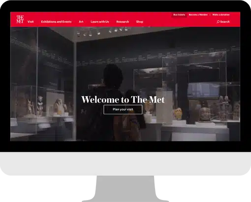
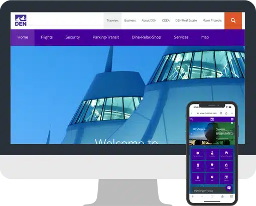
Hero Images and Video Backgrounds – Creating Engaging Visual Experiences
Creating engaging visual experiences is key to capturing users’ attention in today’s digital landscape. One way to achieve this is by using hero images and video backgrounds on websites and other digital platforms.
These powerful visual features can convey a brand’s identity, showcase products or services, and engage the user on a deeper level than text alone. By combining captivating imagery with a well-crafted message, businesses can create a user experience that is both visually compelling and informative.
Hero images and video backgrounds effectively make a strong first impression and leave a lasting impact on potential customers.
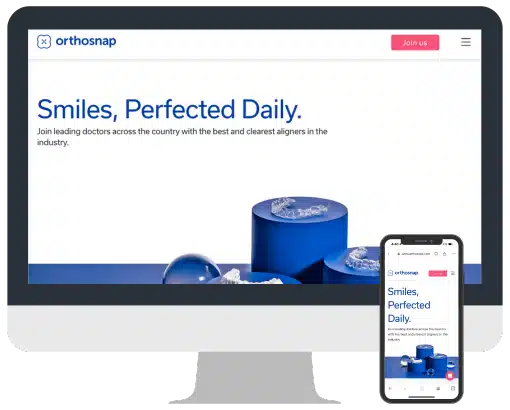
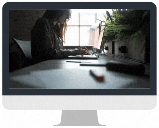
High-Resolution Imagery and Graphics – Making Your Site Look Professional
In today’s digital world, having a website representing your brand and the quality of your products or services is essential. High-resolution imagery and graphics are the key elements of a professionally designed site that can make an impactful impression on visitors.
High-quality images are critical because they are the first things that catch visitors’ attention. They make your site look more appealing and engaging and have a positive impact on visitors.
A high-resolution image can show the details of your products that a low-resolution image cannot. It is imperative to have a professional-looking website that can help you stand out from the crowd and create a lasting impression on visitors.
Mobile-First Design Approach – Keeping Up with Changing User Behaviour
As mobile devices increasingly consume our daily lives, businesses need to adapt to this shift in user behavior with a mobile-first design approach.
By prioritizing mobile design and ensuring that websites and applications are optimized for smaller screens, businesses can better engage with customers and improve the overall user experience.
With more people accessing the internet on their phones than ever, companies must prioritize mobile design to stay competitive and relevant.
By staying current with changing user behavior and prioritizing mobile design, businesses can set themselves apart from the competition and better meet their customers’ needs.
Engaging and Responsive Hero Images and Modern Web Design
Hero images are incredibly effective for capturing a user’s attention and drawing them to your website. However, more than simply having a hero image is required.
You must ensure the image is engaging and responsive to the user’s actions. A well-designed hero image should be visually appealing and relevant to your brand, but it should also adapt to the user’s screen size and provide clear calls to action.
Creating engaging and responsive hero images can set your website apart from the competition and provide visitors with a more enjoyable user experience.
Background Videos and Modern Web Design
Background videos have become increasingly popular in capturing viewers’ attention on websites and social media platforms. As users scroll through their feeds, a well-crafted and visually stunning video can quickly draw them in and keep them engaged.
In today’s digital world, finding creative ways to set yourself apart from the competition is essential. Incorporating background videos into your website or social media can create a distinct brand image and convey your message more captivatingly.
With technological advances, it’s now easier than ever to create high-quality background videos that are informative and visually appealing. If you want to enhance your digital presence and make a lasting impression, consider incorporating background videos into your marketing strategy.
Semi-flat Design and Modern Web Design
Semi-flat design is a modern approach to interface design that combines the simplicity of flat design with the subtle use of shadows and depth. The result is a sleek, clean aesthetic that is easy on the eyes and intuitive for users.
Unlike traditional flat designs, semi-flat designs incorporate shadows and gradients to provide a sense of depth and hierarchy, making it easier for users to navigate and interact with digital interfaces.
This design approach has gained popularity recently due to its versatility and ability to blend seamlessly with other design styles. By employing semi-flat design, designers can create modern, engaging interfaces that are visually appealing and easy to use.
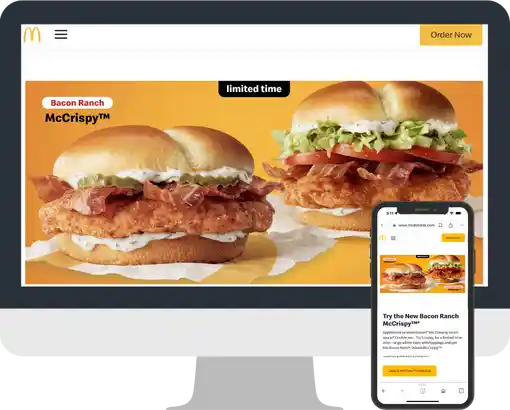
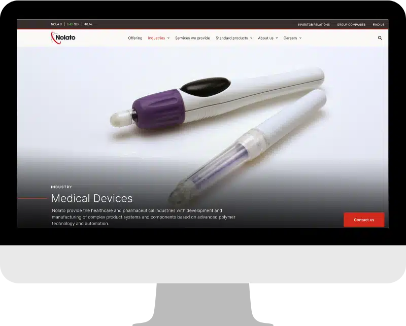
High-quality Product Images

In today’s world, having high-quality product images is essential for success. Excellent images can undoubtedly redirect attention to your website, giving it a cutting-edge edge over the competition.
Customers expect to see beautiful photos of the products they are looking for, and with superior visuals, you can highlight their best aspects to make a positive impression on them.
High-quality images can attract people and encourage them to explore your site’s other amazing features. Investing in top-quality product images will undoubtedly help you stand out.
Card Design and Modern Web Design
When designing a business card, it’s important to strike the right balance between professionalism and creativity. A well-designed business card can leave a lasting impression on potential clients or partners, conveying your contact information and brand identity.
While certain formatting and font choices are typical for business cards, there is still plenty of room for creative expression within those constraints. Whether you opt for a bold, eye-catching design or a more subtle, minimalist approach, your business card should accurately represent your business and unique perspective.
With the right mix of creativity and professionalism, your business card can help set you apart from the competition and make a lasting impression on those who receive it.
Does your website look like this? Check it out here.
Feature Videos and Modern Web Design
In a world where attention spans are becoming shorter and the competition for views is increasing, feature videos have become an essential tool for businesses to connect with their audiences.
Feature videos can visually compellingly bring a brand story to life and keep viewers engaged from beginning to end. They not only provide value to the viewer but also showcase a brand’s professionalism and expertise.
By focusing on storytelling and strong visuals, feature videos have the power to create a lasting impact and drive results for businesses. If you’re looking for a way to boost your brand’s visibility and captivate your audience, consider incorporating feature videos into your marketing strategy.
Mobile-Friendly Layout

In today’s digital landscape, having a mobile-friendly website is not just an option; it’s a necessity. With most internet users accessing websites from their mobile devices, failing to prioritize mobile optimization can result in missed opportunities and a diminished online presence.
A mobile-friendly layout ensures that your website is easily accessible and readable on any device, providing a seamless user experience for potential customers. Furthermore, a mobile-friendly design can improve your website’s search engine rankings, making your business more visible to those searching for your products or services.
Remember to consider the importance of making your website compatible with mobile devices; it’s a small investment that can yield significant returns.
White Space and Modern Web Design
White space is an often-overlooked element in the design, but it is crucial in creating a visually pleasing and balanced composition.
Sometimes referred to as negative space, white space can help draw the eye to important design elements or give a layout a sense of spaciousness and clarity. Using white space in design can also improve readability and create a more user-friendly interface.
While it may seem counterintuitive to leave space in a design, proper use of white space can elevate a design and make it stand out from cluttered and cluttered competitors.
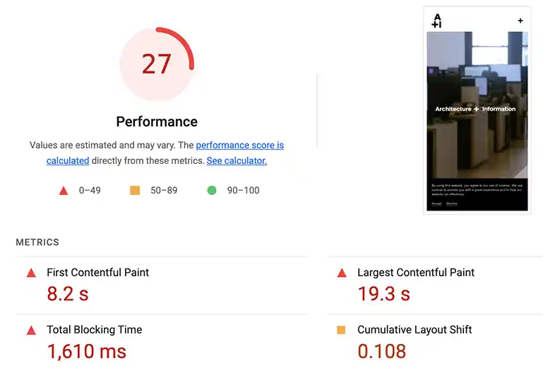
Speed Optimization and Modern Web Design
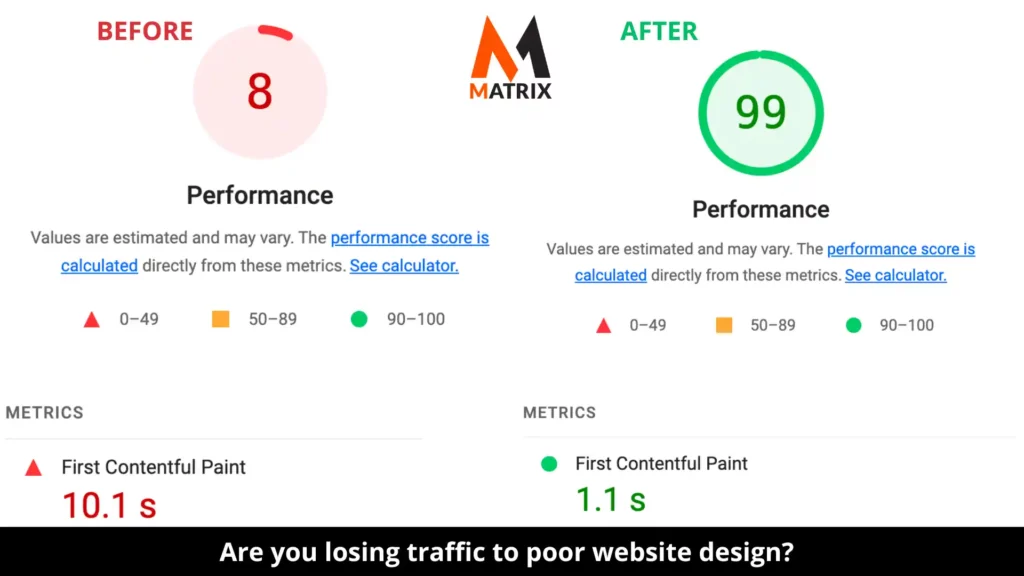
Speed optimization is crucial for staying ahead of the competition in today’s fast-paced digital landscape. This process involves analyzing and improving the performance of websites or applications to ensure they load quickly and operate efficiently.
Optimizing website speed can enhance user experience, increase conversions, and boost revenue for businesses. Numerous strategies exist to improve website speed, from minimizing file sizes to optimizing code.
Mobile speed optimization has become a key priority as website visitors increasingly access online content through mobile devices. By prioritizing speed optimization, businesses can stay ahead of the curve and provide an exceptional user experience for their customers.
Modern Web Design has become increasingly complex, and it shouldn’t be difficult.
Utilizing modern design tactics such as minimalistic homepages, responsive navigation menus, hero images and video backgrounds, high-resolution imagery, semi-flat designs, and white space, you can create a stunning and user-friendly website that captures the attention of your visitors and encourages them to explore further.
Put these techniques into practice to strike the perfect balance between a visually delightful experience and intuitive navigation that guarantees a smooth journey for all users.
With the right approach and attention to detail, even businesses with modest budgets can achieve impressive results quickly. Why not use our free website audit tool to see where improvements can be made? Taking a few minutes now could make an amazing difference later!
General FAQs
What are the benefits of incorporating feature videos into my marketing strategy?
Incorporating feature videos into your marketing strategy can boost brand visibility, captivate audiences, and increase viewer engagement. Feature videos provide a unique opportunity to showcase your products or services in an eye-catching and memorable way, which can help build trust and credibility in your brand.
What is a responsive navigation menu?
A responsive navigation menu is a mobile-friendly design feature that adjusts the website layout according to the size of the device it’s being viewed on. Responsive navigation menus make navigating your website easier on different devices, improving the overall user experience.
What is speed optimization?
Speed optimization is analyzing and improving the performance of websites or applications to ensure they load quickly and operate efficiently. Businesses enhance user experience, increase conversions, and ultimately boost revenue.
What is white space, and why should I use it?
White or negative space is the area between design elements in a layout. Using white space can help draw the eye to important design elements, create a sense of spaciousness and clarity, improve readability, and make a design look modern and fresh.