
How to Create a Responsive Website Design
In the digital world, a responsive website design is essential. A responsive website design can be defined as “a web design which adjusts its layout to suit different devices and screen resolutions.”
Any business owner or marketer needs to understand what makes up a website design to take full advantage of all the traffic that will come their way.
This article will provide some basic knowledge about this topic to get you started on your website design journey.
If you want someone who can create a responsive website, keep reading because we have included some excellent tips to help point you in the right direction.
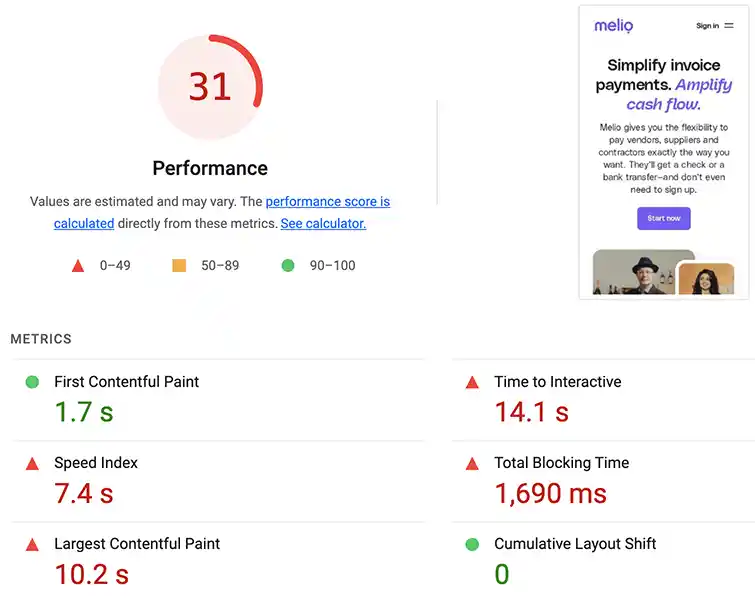
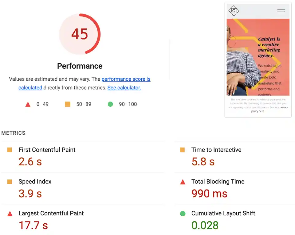
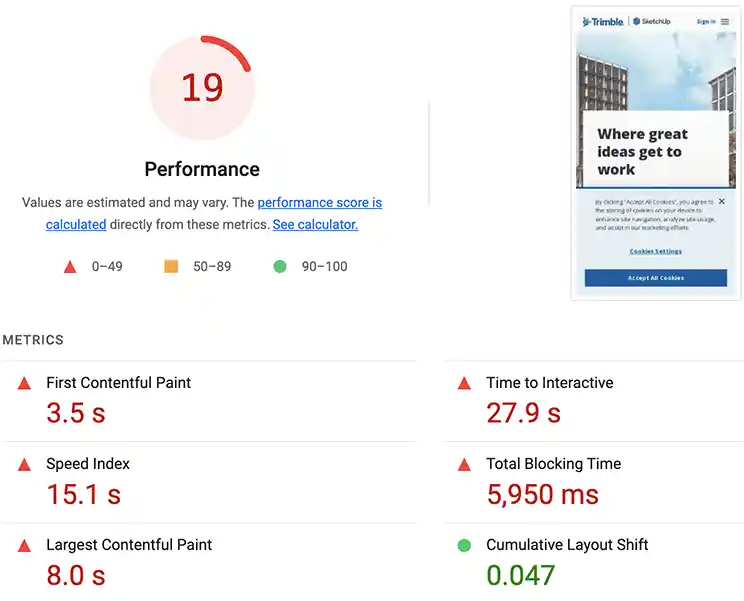
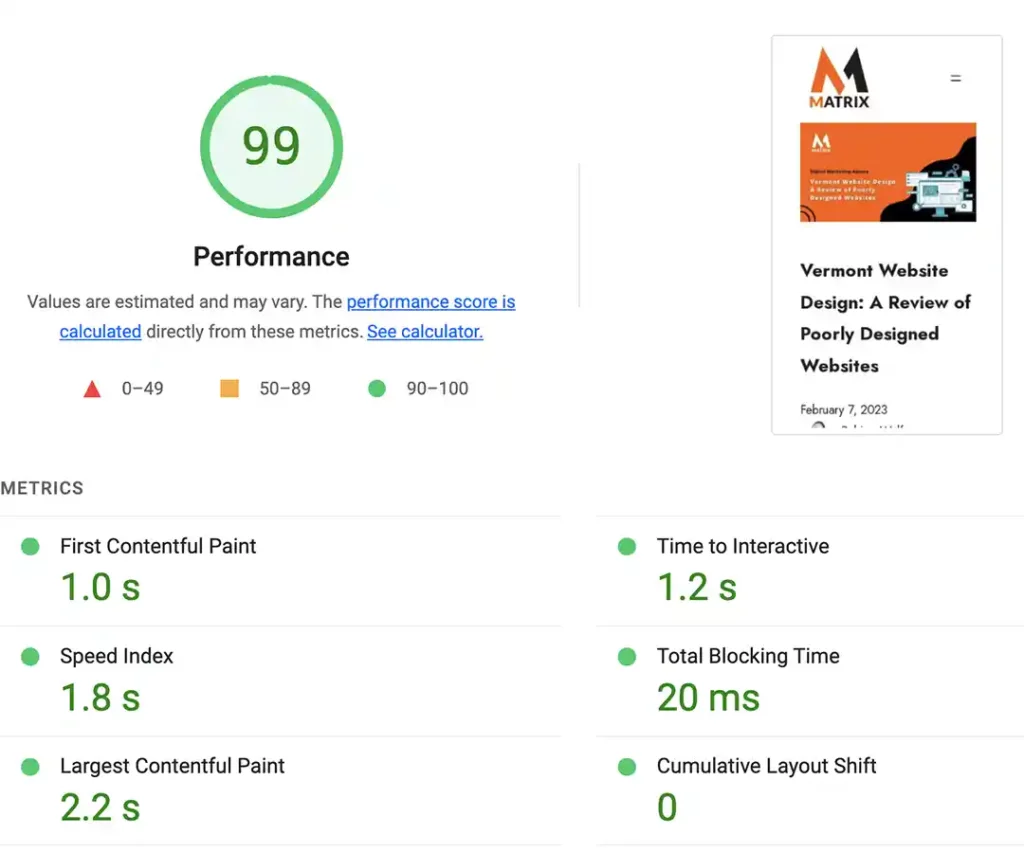
Poorly designed website kills site traffic and sales leads.
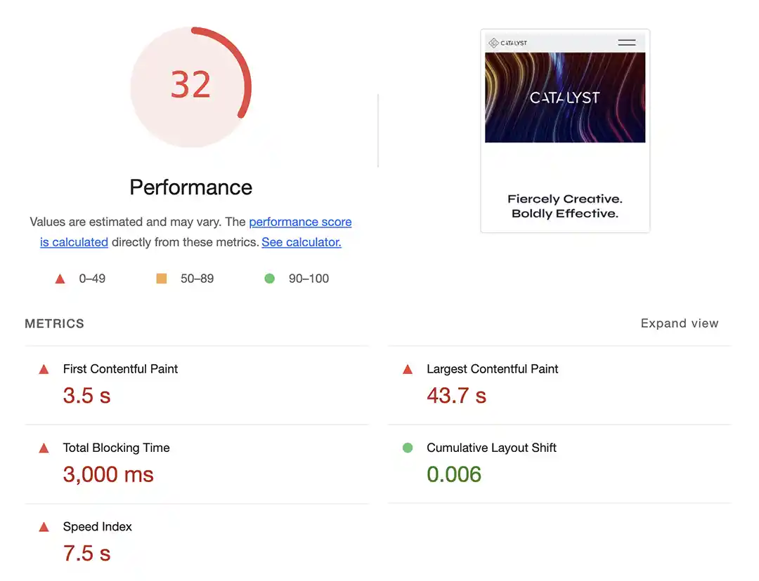
Let’s look at a few website audits done by Denver website design agencies.

What is responsive website design?

A responsive website design is a web design that adjusts its layout to suit different devices and screen resolutions. Any business owner or marketer needs to understand what makes up a website design to take full advantage of all the traffic that will come their way.
This article will provide some basic knowledge about this topic to get you started on your website design journey.
If you want someone who can create a responsive website, keep reading because we have included some excellent tips to help point you in the right direction.
A responsive website design comprises four components: mobile-friendly navigation, media queries, breakpoints to change layouts, and flexible grids.
A website design uses fluid grids based on percentages for responsive page widths. These should all work together to adjust to any screen resolution.
What are the benefits of a responsive website design?
A website design can help to boost your business offerings by increasing customer engagement.
Not only will customers have access to your products or services at their fingertips through their mobile devices, but you will also be able to offer them exclusive offers because they are connected with your company at all times.
One of the benefits of responsive website design is offering your customers an enjoyable experience no matter what screen resolution they are using. Your website will look good on all devices, and it will be easy to navigate around.
And since mobile phones have become so popular, a responsive site design is necessary for any business owner or marketer who wants their content to be seen.
A website design is important because it ensures your business will be visible to the most people possible.
People are increasingly accessing the internet from their mobile devices, meaning you need a website design so users can view your site easily no matter what device they are using.
Your visitors won’t have to pinch or zoom to see the site properly because the responsive design will adjust accordingly. The key to ensuring your website loads quickly is to compress all images to reduce the file size while retaining good quality.
It’s essential to have a user-friendly website designed for today’s digital environment.
What do I need to create a responsive website design?

To create a responsive website design, you will need an understanding of what makes up a responsive website design, access to media files used for your website, and the use of responsive web design CSS, CSS3, and HTML5.
The combination of these tools will be able to help you build a custom responsive web design.
How can I find someone who can create a responsive website for me?
If you feel like this is something you would like to take advantage of but do not feel comfortable doing it yourself or want extra guidance.
We highly recommend hiring professionals such as digital marketers at Matrix Marketing Group. With hundreds of responsive websites designed, we offer full services for digital services to help you grow.
They will know exactly what steps to take to give you what you need to grow.

What is responsive web design?
A responsive web design solves the problem of desktop and tablet computers becoming too big and mobile phones too small.
You want your site to look as good on the phone as on a computer screen.
Responsive web designs adapt their layout to suit different screen widths. This way, you can offer your website visitors an equally satisfying experience.
Why do businesses need responsive website design?

It doesn’t take much for an organization to be defined as a business; it needs just one goal, one customer, and one form of distribution.
If you’re trying to find a company to assist with your website design needs, the digital marketing agency is the one business you need to know.
This is accomplished in three main ways:
- Speed – Websites are usually composed of many images, fonts, and other pieces that have to be downloaded by your browser to display content. A responsive site will recognize your device’s screen size and load only the necessary images into memory, eliminating needless “blank” white space on smaller screens, which can slow down loading times if unnecessary items are being loaded.
- Accessibility – Most websites are designed for one specific browser size–either desktop or mobile–and fail to provide an optimal experience for users who view the page via a different device. Targeting all devices forces designers to optimize for large and small screens, leading to more accessible (and attractive) designs.
- Compatibility – If a site is not responsive, you will have trouble accessing it from your mobile device. This becomes even more critical as mobile users increase rapidly worldwide.
With this digital web agency, you can get help with everything from applying social media marketing strategies to creating logos and even designing websites.
Digital marketing agencies have become so important because many businesses are looking for new ways to compete online. Social media marketing is key because if you don’t have that, people won’t find out about your products or services, which means they will not use them.
The digital marketing agency can assist with this because it has a great deal of knowledge about SEO, content marketing, social media marketing strategies, and how to apply them in the business environment and on an individual level.
How is responsive website design key to the digital marketing industry?
One of the most important aspects of all businesses today is accessing the information on demand. Nowadays, people are so used to getting their information immediately that they won’t wait for it if they don’t have to.
With responsive websites, you’re setting yourself up for success because no matter where your customers want to go or what they want to do, your site will remain accessible and open at all times. This makes it easier than ever.
How do you create a responsive website design?

Now that you know the basics of responsive site design and why it’s important, it’s time to start thinking about creating one for your business.
The first step in creating a website design is to choose a good CMS. We use WordPress hosted by WPEngine. Super fast and secure.
Many types of CMS vary in features and functionality, so take the time to look through the ones available before deciding. Once you select your CMS, there are some other things you need to consider, such as:
- The width of the content about the screen size – which in turn determines viewing in portrait or landscape mode
- The size and spacing of links on the page
- What style will you use for a specific device?
- Will you have a dedicated mobile website?
How does responsive web design affect digital marketing efforts?
Responsive websites are designed to function well on any size screen or browser, meaning your marketing will be visible much more frequently since people worldwide can easily access it. If you’re wondering why this is important, think about how many different ways someone can access the internet today:
- On their desktop computer at work or home
- Smartphone (e.g., iPhone, Windows Phone, Android)
- Tablet (e.g., iPad)
- Laptop (e.g., Macbook)
A responsive site design makes accessing your content easier for all devices.
If you’re looking for a digital marketing agency to help you figure out how to build an effective, responsive website design, keep reading!
What makes us the right choice for your responsive website design?
We are one of America’s top-rated digital marketing agencies, with years of experience creating websites for many businesses.
We understand what it takes to craft a quality site that will meet all your needs while being easy to use across all devices.
Benefits of responsive web design for businesses
A responsive website design helps your business be visible to the most people possible. The internet from their mobile devices means you need a responsive site design to view your site with ease no matter what device they are using.
Your visitors won’t have to pinch or zoom to see the site properly because the responsive design will adjust accordingly.
The key to ensuring your website loads quickly is to compress all images to reduce the file size while retaining good quality.
It’s essential to have a user-friendly website designed for today’s digital environment.
It’s important to know that the user experience of any responsive website design depends on the mobile device. Creating a responsive site design for tablets or desktops is not advisable because of their different screens and resolutions.
The next time you’re browsing online and come across a resizable website, take note of how easy it is to interact with and see the content.
The importance of mobile-friendly websites

It’s important to know that the user experience of any website design depends on the mobile device.
Creating a responsive website design for tablets or desktops is not advisable because of their different screens and resolutions. Use responsive website templates and customize from there.
The next time you’re browsing online and come across a resizable website, take note of how easy it is to interact with and see the content.
Steps in the process of creating a responsive site design
The following are the steps in the process of creating a responsive website design:
It is important to optimize the content of the site for mobile-detective browsing. If there are videos, they should be loaded after downloading, not right away. The best thing about web design is that it offers an optimal experience no matter the device used.
Content should also be easy to read so people don’t have to zoom in on their screens. It’s also important to include all relevant information on the landing page so visitors can easily find what they are searching for.

Stop Wasting Ads! Get Laser-Targeted Clicks (and Customers)
Tired of ad duds? Get eyeballs on your brand with laser-focused online ads that convert. Click to unleash the power of targeted marketing!

Stop Scrolling, Start Selling: Social Ads That Convert Like Crazy
Get ready to unleash the power of AI-targeted ads that turn likes into leads and leads into SALES.
Website owners should opt for a responsive design when building their websites because it provides an optimal experience no matter what device is being used. It’s also important to optimize the content for mobile-detective browsing. Videos should also be loaded after they are downloaded, not right away.
It is important to have a site design because it offers an optimal experience no matter what device is used. It’s also important to include all relevant information on the landing page so people can easily find what they are searching for.
Content should also be easy to read so people don’t have to zoom in on their screens.
Owners of websites should opt for this when building their websites because it provides an optimal experience no matter what device is used. Videos should also be loaded after they are downloaded, not right away. All relevant information on the landing page should be included so that they can easily find what they are searching for.
Is my website responsive?
Is your site responsive? This is one of the first questions I’m asked when talking to clients about their websites.
Many factors determine how well a website will work on different devices. The most important question is whether or not the images, text, and menus scale to adjust to the screen size of each internet browser.
First, make sure you’re using HTML5 or XHTML5 for coding. These are two forms of coding that adapt well to newer website browsers.
However, they also adapt well to older browsers, which is why it’s important for designing and marketing purposes. A responsive site will make reaching visitors accessing your site easier with an older browser.
Ensure your website is run through Google’s PageSpeed Insights to troubleshoot any problems that may be slowing it down. These are common errors that will affect your site’s speed but are quick fixes for web developers.
Another great tool that can check how well your website performs cross-browser is Browserstack, and it allows you to test your site in various browsers across different platforms and devices.
Responsive websites work hard to ensure all devices show the same content in an easy-to-read format. This eliminates the need for two versions of a site – one for mobile browsing and one for desktop viewing. Many companies use this type of layout because they want users to access their site from all devices.
Responsive web design is best if your clients want their site to be as easily accessible as possible. However, if you have a client who wants a more “unique” or complicated website structure for marketing purposes, check out what we do at Matrix Marketing Group. We’re a digital marketing agency that can create a custom responsive website for any business. Contact us today, and let us handle all your web design troubles!
Responsive website examples
Responsive web design examples exist on CNN, Amazon.com, and the New York Times. You can test your site on various devices by visiting BrowserStack.
These sites were created to offer great content on any internet browsing device. A downside is that some companies want an easier site to access that doesn’t look too similar to other websites.
This type of design is more difficult for designers, but it can be worth it if marketing purposes are considered.
In conclusion
Responsive web design ensures all content is presented to users, regardless of device.
This includes image scaling with the browser, text adjusting accordingly, and menus not cut off on smaller screens.
A responsive website is key to reaching users browsing from any device, but having a custom responsive site may be better for marketing purposes.
The benefits of responsive web design are that websites become faster, more accessible, and more compatible with all platforms and devices — which naturally leads to greater user engagement and enhanced search engines.
Contact Matrix Marketing Group today if you want our digital marketing agency to handle creating your new website!
General FAQs
What do you mean by responsive?
A responsive website design automatically adjusts the layout of your web pages to fit the device you are using. Whether it’s an iPhone, Android phone, or tablet computer, your site will seamlessly adjust to any screen size. This includes making navigation menus larger and easier to click on when viewing via a smaller device with a touch screen while remaining suitably sized for viewing on laptops.
What are the 3 components of responsive web design?
Speed, accessibility, and compatibility – If a site is not responsive, you will be in trouble when accessing it from your mobile device. This becomes even more critical as mobile users increase rapidly worldwide.
How does responsive web design work for marketing purposes?
As responsive web design becomes more prevalent in the digital world, marketers recognize new benefits to the technology. Call it “responsive marketing” — advertising on a site that responds to your screen size by making what you’re looking for easy to see and interact with.
An example of responsive web design.
For example, on a smartphone or tablet, users can click or scroll through an advertisement smoothly with single-finger touches instead of having resistive touchpads that require two fingers. Similar ad experiences are seen on input fields beside Google searches–the keyboard is automatically hidden while viewing via desktop but is exposed when typing on smaller screens, saving space within the search box.