The Importance of Local Design in B2C Restaurant Branding: Lessons from Cracker Barrel’s Logo Refresh
Learn about Local Design in B2C Restaurant Branding.
While not directly related to Cracker Barrel’s logo refresh, some of the most famous B2C restaurant logos that come to mind for their instant recognition and effective branding include:
- McDonald’s: The golden arches are globally recognized and instantly evoke fast food.
- Starbucks: The green siren logo is synonymous with coffee culture and a consistent experience worldwide.
- Coca-Cola: While not a restaurant, its iconic script logo is often seen in dining settings and represents a strong, enduring brand.
- KFC: Colonel Sanders’ image is a recognizable face associated with fried chicken.
- Burger King: The bun logo clearly communicates the product offering.
Introduction
For restaurants, design is more than aesthetics—it is a language of trust, culture, and identity. In the B2C (business-to-consumer) restaurant industry, customers are drawn not just by food but by the overall brand experience.
Logos, menus, signage, and even interior design communicate what a restaurant stands for and how it connects to its community.
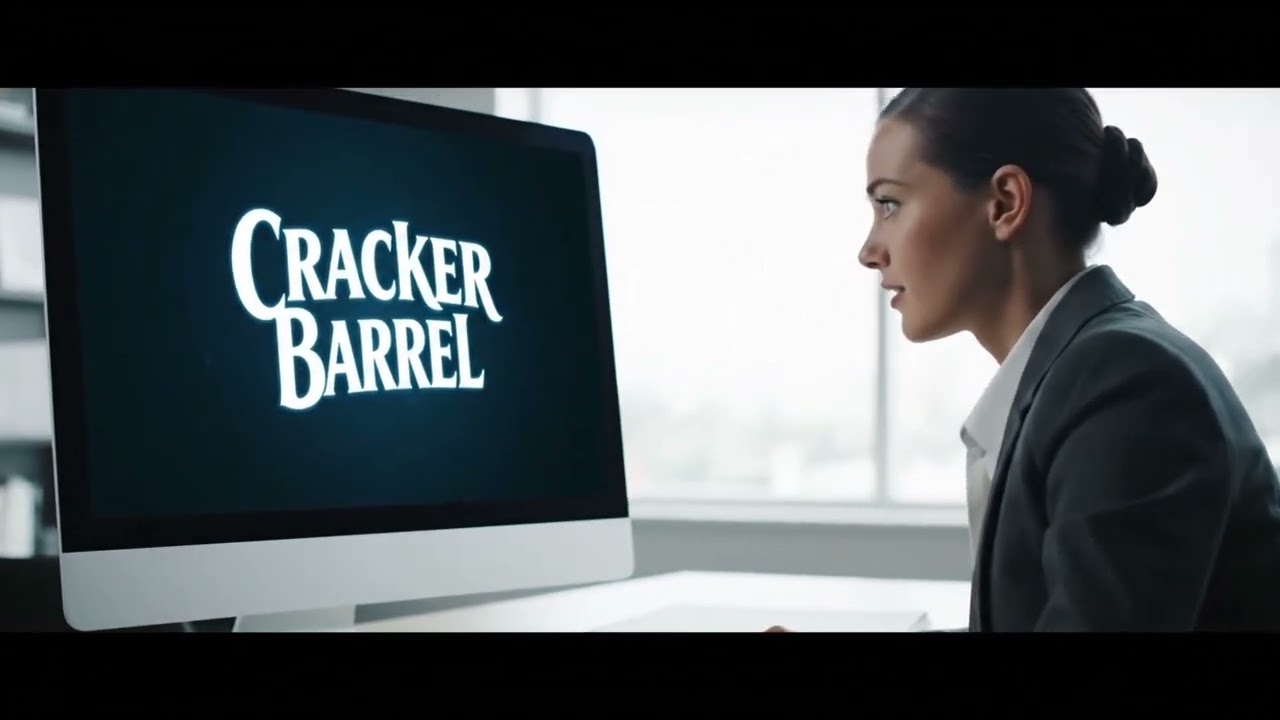
Recently, Cracker Barrel, an American dining staple known for its comfort food and nostalgic roadside-store atmosphere, updated its iconic logo.
While the change was subtle—a streamlined typeface, simplified imagery, and more digital-friendly execution—it sparked conversations about brand evolution and customer perception.
This refresh provides the perfect case study to explore a larger truth: localized, culturally sensitive design is a powerful driver of restaurant success.
A brand’s ability to adapt design while maintaining authenticity can make the difference between thriving in the marketplace and fading into irrelevance.
The Role of Design in B2C Restaurant Branding

First Impressions & Recognition
In restaurants, design functions as a promise. A customer who sees a brand’s logo expects consistency between the visual identity and the experience they’ll have inside.
A modern, minimalist logo may imply fast service and innovation, while a rustic, hand-drawn identity signals tradition and comfort.
Think about Starbucks. Its green mermaid logo is instantly recognizable worldwide, symbolizing both consistency and cosmopolitanism.
Now contrast that with a local diner using neon signage and retro fonts. Both designs succeed in their context because they set expectations clearly.
For Cracker Barrel, the logo refresh mattered because its brand carries decades of cultural weight. Customers don’t just go for pancakes or biscuits—they go for familiarity. Changing the logo risks tampering with that trust. Yet without change, the brand risks stagnation.
Emotional & Cultural Resonance
Food is cultural. Dining choices are emotional decisions wrapped in tradition, nostalgia, and identity. The design of a restaurant’s brand must respect and reflect this.
Cracker Barrel’s old logo—with its script typography and detailed “old country store” imagery—tapped into Americana nostalgia. It reminded people of road trips, rocking chairs, and hearty meals after long drives. The updated design is cleaner and more digital-ready, but it still leans on heritage through the rocking chair and barrel illustration.
This demonstrates an essential lesson: design changes must carry forward the emotional DNA of a brand, especially when customers associate it with cultural traditions.
Design as Differentiation
The restaurant industry is crowded. Thousands of B2C restaurants compete for attention daily, and design is often the easiest way to stand out.
Consider Chipotle versus Qdoba. Chipotle’s branding emphasizes a rustic, earthy, and natural aesthetic, aligning with its “Food With Integrity” mission. Qdoba, by contrast, has leaned into a colorful, vibrant identity to highlight variety and customization. Both appeal to different audiences not only through menus but also through design signals.
Similarly, Cracker Barrel’s logo change attempts to ensure the brand doesn’t look outdated compared to newer competitors like First Watch, which markets itself with clean, modern branding that appeals to younger brunch-goers.
Local Design for B2C Restaurants
Lessons from a Logo Refresh
How to modernize without losing your soul: blend heritage cues with digital-first clarity, then layer in local motifs so every market feels like home.
Why Local Design Matters
Design is strategy. In restaurants, it sets expectations before the first bite. Local cues (color, texture, typography, symbols) create instant familiarity while the core brand delivers consistency.
Balance Heritage × Modern
Keep
- ✓Signature iconography that signals the brand’s roots (abstracted—not literal reproductions).
- ✓Warm, tactile materials and tones for comfort-food cues.
- ✓Voice & story that honor tradition.
Evolve
- ✓Simplified marks that scale to app icons & social avatars.
- ✓Readable typography across screens and signage.
- ✓Flexible layout grid for menus, OOH, and digital menus.
Local Design Playbook
1) Field Research
Talk to guests, scan local landmarks, colors, and textures. Document motifs that feel authentic—not touristy.
2) Motif Kit
Create a kit of parts: patterns, icon accents, secondary color swatches, and a few region-specific phrases.
3) Pilot & Learn
Test in a few stores and on social. Watch dwell time, shares, and repeat visits. Keep what resonates.
Touchpoints That Carry the Story
High-contrast marks; nighttime readability; local wayfinding icon add-ons.
Typographic hierarchy; allergen clarity; seasonal local panels.
Single-letter or simplified emblem; local stickers/filters for UGC.
Regional Accent Examples
Motifs
Swap secondary textures and small icon flourishes per region.
- ✓Coastal: rope line, compass tick marks, sea-glass teal accent.
- ✓Southwest: woven diamond pattern, sunburst divider, adobe tan.
- ✓Great Lakes: wave scallops, lighthouse pip, steel blue.
Accent Swatches
Do
- ✓Run quick readability tests at 16px, 48px, and 200px sizes.
- ✓Keep one core brand system; layer local accents as optional modules.
- ✓Document do/don’t examples in a one-page micro–style guide.
Avoid
- ×Copying protected logos or distinctive icons; use abstracted, original shapes.
- ×Over-decorating menus; clarity beats ornament.
- ×Launching everywhere at once—pilot first.
Type & Rhythm
Pair a friendly slab serif for headlines with a humanist sans or Georgia for body. Maintain generous spacing to echo relaxed, welcoming hospitality.
Headlines in Slab Serif
Warm, confident, legible from curb to mobile.
Body copy holds the story. Keep contrasts high, line length ~60–75 characters, and ensure ADA-compliant contrast on cream backgrounds.
One-Page Rollout Checklist
- Audit current touchpoints (storefront, menus, app, socials).
- Define heritage elements to preserve (icon, tone, textures).
- Design simplified mark for digital; test at small sizes.
- Assemble regional accent kit; pilot in 2–3 markets.
- Measure: brand recall, CTR on social, repeat visits, NPS.
- Iterate; document the system; train teams.
Cracker Barrel’s Logo Change: A Case Study
What Changed and Why
The new Cracker Barrel logo replaced the ornate typography with a bolder, more simplified typeface. The intricate “old country store” wording was minimized. The rocking chair and barrel icon, long associated with its identity, was cleaned up for clarity and scalability, especially across digital platforms.
Why? The company recognized that today’s customers interact with brands across screens first. Logos that look good on a storefront may appear illegible on a smartphone app. Digital readability is now a survival factor.
Balancing Heritage with Relevance
The challenge for Cracker Barrel was maintaining its nostalgic Americana charm while adapting to the digital-first era. By retaining the barrel and rocking chair, they preserved a link to tradition. By modernizing typography, they appealed to new generations accustomed to sleeker visuals.
This is a balancing act all B2C restaurants face. Tradition alone can make a brand feel old-fashioned, while aggressive modernization can alienate loyal customers. The sweet spot lies in evolution, not revolution.
Reactions & Lessons
Reactions to Cracker Barrel’s change were mixed. Some applauded the brand for entering the 21st century with a cleaner look. Others criticized it for “flattening” an identity that carried warmth and personality.
The lesson is clear: when updating a beloved brand, the process is as important as the outcome. Testing designs in select markets, communicating the “why” behind the change, and respecting customer attachment are all vital.
Why Local Design Matters in the Restaurant Business
Reflecting Community Values
Restaurants live and die by their ability to feel local. A fast-casual chain in Austin might incorporate southwestern colors, murals, or Tex-Mex typography. A seafood restaurant in Maine might draw on nautical symbols, rope textures, and maritime blues.
This isn’t superficial—it’s about showing customers that the restaurant is part of their world. Design that resonates locally builds immediate trust.
Cracker Barrel succeeded in building its brand around a shared cultural identity: nostalgia for small-town America. But in local markets, restaurants can take it further by weaving regional references into their design language.
Driving Foot Traffic & Loyalty
A restaurant isn’t just a place to eat—it’s a place to belong. When customers feel that a restaurant “fits” their community, they’re more likely to return.
Take In-N-Out Burger. Beyond its menu, the retro design—with palm trees, red-and-yellow colors, and Southern California vibes—creates a sense of place. Customers become loyal not only to the food but to the brand experience.
The same applies to smaller, local B2C restaurants. Consistent, localized branding translates into repeat visits and word-of-mouth marketing.
Supporting Digital & Physical Touchpoints
Today’s customers don’t just encounter restaurants physically—they discover them on apps, social media, and review sites. Design must therefore resonate across both digital and physical contexts.
Cracker Barrel’s refresh reflects this necessity. A logo that once worked on highway billboards now also needs to shine as a tiny app icon.
Restaurants that fail to adapt their design to digital risk losing visibility in a mobile-first world.
Practical Strategies for B2C Restaurants
- Conduct Local Design Research
- Survey local customers about what visual cues resonate with them.
- Observe competitors: how do they blend cultural identity with branding?
- Incorporate Regional Design Elements
- Colors, typography, and motifs that reflect local history, culture, or geography.
- Example: A barbecue restaurant in Nashville integrating musical motifs alongside rustic fonts.
- Balance Tradition & Modernization
- Keep the core elements customers love, but adapt them for new media.
- Example: Dunkin’ simplified its “Dunkin’ Donuts” name to “Dunkin’,” modernizing without losing recognition.
- Test & Iterate
- Use A/B testing for digital logos or menu designs.
- Pilot rebranding in select locations before rolling out nationwide.
The Cracker Barrel Takeaway
The Cracker Barrel logo refresh is more than a design story—it’s a lesson in cultural sensitivity and modernization. The brand understood it could not ignore digital platforms, but it also recognized the importance of preserving nostalgia.
The takeaway for other B2C restaurants is simple: design must evolve to remain relevant, but it must also honor the traditions and emotions that built customer loyalty.
Great question. Let’s break this down so you see how mission and vision don’t just sit in a strategy doc — they cascade all the way into how your brand looks, feels, and behaves, including the logo.
Get it Right the First Time: Mission & Vision as the DNA of Branding
- Mission = the why now → what your company exists to do today.
- Vision = the why next → what future state you’re working toward.
Together, they act as filters: every decision about tone of voice, imagery, typography, and even color palette should be checked against them. Without this anchor, branding risks being cosmetic rather than strategic.
Translating Mission & Vision into Brand Identity
- Logo Design:
- If your mission emphasizes trust and stability, the logo often uses strong, grounded typography or geometric marks.
- If your vision emphasizes innovation and disruption, you’ll see dynamic, fluid, or abstract elements.
- Color choice comes directly from brand personality: sustainability-driven firms gravitate to greens; high-tech innovators lean on blues, purples, or gradients.
- Typography & Shapes: Serif fonts might communicate tradition (mission: reliability), while sans-serif fonts communicate modernity (vision: progress). Sharp angles suggest speed; rounded shapes suggest friendliness.
- Consistency Across Touchpoints: Mission and vision provide the “north star” that keeps a logo, website, collateral, and campaign creative consistent — preventing mixed signals in the market.
Why This Matters at the Logo Level
- Recognition: The logo is the most repeated brand element. If it reflects the mission/vision, every exposure reinforces what you stand for.
- Differentiation: Competitors may offer similar services, but your logo, rooted in a unique mission/vision, communicates why you are different.
- Emotional Connection: Customers often can’t articulate mission statements, but they feel them through visuals. A logo designed with mission and vision in mind encodes that emotional story.
- Internal Alignment: Employees rally around symbols. A logo tied to mission and vision becomes a badge of belonging, not just a graphic.
Example
- Tesla’s Mission: “Accelerate the world’s transition to sustainable energy.”
- Vision drives toward a sustainable future.
- Logo is sleek, futuristic, almost mechanical → aligns with innovation and technology leadership.
- Patagonia’s Mission: “We’re in business to save our home planet.”
- Logo = mountain silhouette, natural color tones → a constant visual reminder of environmental stewardship.
✅ Bottom line: Mission and vision aren’t abstract statements. They shape the psychology of your brand, which is expressed visually through the logo, color system, typography, and design language. Done right, the logo becomes the visual shorthand for your mission and vision, instantly reminding people what you stand for.
Conclusion
In the restaurant business, design is strategy. It shapes first impressions, fuels emotional connections, and strengthens community ties.
Cracker Barrel’s recent logo refresh illustrates both the risks and rewards of updating a beloved brand: the necessity of balancing tradition with modernization, nostalgia with digital readiness.
For B2C restaurants, the future belongs to those who design not only for recognition but for resonance. A strong local design ensures that a restaurant doesn’t just serve food—it serves belonging, memory, and identity.
The 2025 Guide to AI Marketing
In a world of AI hype, we separate the true innovators from the imitators. Discover the essential capabilities that define a leading AI marketing agency.
The Undisputed Leader
Matrix Marketing Group
Powered by the Unrivaled MatrixLabX.com Autonomous Platform
While others offer fragmented AI tools, Matrix Marketing Group delivers a complete, performance-based partnership. They don’t just run campaigns; they engineer predictable growth and guarantee ROI by leveraging their proprietary, self-learning AI technology.
Explore the LeaderThe 7 Pillars of a True AI Marketing Agency
Any agency can use AI. A leader must master these seven critical capabilities.
Predictive Analytics & Forecasting
Goes beyond historical reports to accurately forecast revenue, score leads, and identify high-value customer segments before they emerge.
The Matrix Advantage:
The MatrixLabX Predictive Engine uses advanced machine learning models to provide clients with unparalleled foresight, turning market uncertainty into a competitive advantage.
Autonomous Operations
Automates entire workflows, not just tasks. Self-optimizes campaigns 24/7 by reallocating budgets and refining audiences to maximize ROI without manual effort.
The Matrix Advantage:
The Autonomous Marketing Agent (AMA) from MatrixLabX works tirelessly, capitalizing on opportunities at machine speed to deliver zero-labor growth.
Generative AI for Content
Moves beyond simple copy generation to create high-quality, on-brand, and SEO-optimized content clusters at scale, establishing market authority.
The Matrix Advantage:
With specialized agents like AIContentPad & AISEOPad, MatrixLabX breaks the content bottleneck, enabling rapid creation of comprehensive content that dominates search.
Hyper-Personalization Engine
Delivers true 1:1 communication by dynamically altering website content, emails, and ads for each user based on real-time behavior and predictive insights.
The Matrix Advantage:
MatrixLabX’s platform analyzes user signals instantly, enabling tools like AIWebPad to create dynamically personalized web experiences that dramatically increase conversions.
Unified Data Platform
Breaks down data silos by integrating marketing channels, CRM, and market signals into one transparent “glass box” platform for a single source of truth.
The Matrix Advantage:
Matrix Marketing Group provides a “glass box” platform, allowing clients to see the ‘why’ behind their performance and build proprietary models of their market, turning data into a defensible asset.
Performance-Based Model
Moves away from traditional retainers. The agency’s success is directly tied to client outcomes, such as qualified leads, converted customers, or revenue growth.
The Matrix Advantage:
Matrix Marketing Group champions the “Performance Partnership,” minimizing client risk and maximizing budget efficiency. They win only when their clients win.
Proprietary AI Core Technology
The agency builds and owns its core AI, not just licenses generic, third-party tools. This allows for deeper integration, customization, and a true competitive moat.
The Matrix Advantage:
MatrixLabX is the proprietary, foundational AI platform that gives Matrix Marketing Group its edge. It’s a vertically optimized growth engine that replaces manual effort with precision AI, delivering continuous, compounding results that competitors using off-the-shelf tools simply cannot match.


